Introduction
The purpose of this article is to analyse accessibility problems on websites noticed by the authors during their usual daily work (and sparetime) and put them into relation with Grice's Conversational Maxims and Wilson & Sperber's Relevance Principle.
Rollyo.com
 Rollyo is a relatively new site offering its users means to create their own little search engines based on Yahoo!. These search engines can then also be embedded into 3rd-party pages. As a bonus Rollyo als lets people add these custom search engines to the searchbar of their Firefox browser.
Management
 Right on the startpage Rollyo offers a management box which holds for example the "Manage your searchrolls" link. Guessing from the semantics of its name this link should guide you to a form for editing first your searchroll-list and then also let you edit at least your own rolls. The above link in this case would be unnecessary since it should actually be part of the management form.
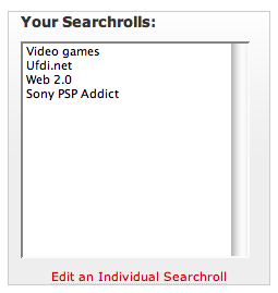 Following the "Manage your searchrolls" now leads to a page with 2 listings for trashing your searchrolls. Under the left selection box one can find a small link for "Edit[ing] an individual searchroll". Based on its position one would expect it to require the selection of one (and only one) item from the listing above it. The only indication that this assumption might not be correct is the fact, that the "Edit" element is not a button but a link.
Now, clicking this link while an item is selected, an overlay appears which only lists the user's own searchrolls (those which were created by her). So there is no direct way to simply select the item and then get within one click to the edit-form, as the position of the link actually would suggest.
Based on Grice's Maxims this would violated the Manner maxim since the link is positioned too close to the selection box to which it has basically no relation. Here it would be better, to put the link at the outside of this box. Another maxim, that this link violates is the quality maxim, because in the background there is the distinction between searchrolls the user has created, which can be edited with this link, and searchrolls created by other users the user has "subscribed" to, which are also included in the listing above the "edit"-link. The other two maxims (relevance and quality) are in our opinion not violated because the "edit" link should definitely be part of the the management form and what is symbolizes is basically correct; just not complete.
Concerning the relevance principle this link has a problem, too: The link is actually very relevant but only hard too understand thanks to the unusual popup window, its position and size. Also at first it might be hard to understand why only a subset of the list shown right above the link is available in the popup.
ris1.bka.gv.at
The "Rechtsinformationssystem" of the Austrian Chancellor is an archive for laws, decrees and similiar documents which can be accessed by the public. Each document is available for download in multiple common formats in order to make them accessible to the widest possible range of online-users.
Downloads
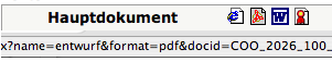 Every paper available on ris can be "downloaded" in multiple formats: as Microsoft Word document, as PDF and as plain HTML. The icons would suggest, that these are normal downloads, but they aren't. They are embedded in a popup page which makes downloading much harder if a respective filetype-handler is installed for the browser.
Here the Quality Maxim in combination with the Manner Maxim might be violated since the icons actually indicate some kind of download while the actual result is an embedding of the specified document.
Navigation/Pagination
When the number of search results requires to render multiple pages the site offers a simple pagination system where the user can go to the next/previous page if available. There are three problems with the approach chosen by the authors of this site:
- An enabled next/previous link is nearly indistinguishable from a disabled link. Besides of that the symbols used for next and previous page are the same (a right-arrow) which is confusing for the previous page link.
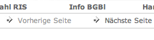
- The user doesn't know, how many result pages there are. The number of total search results is shown, but only in combination with the number of items shown per page could the user determine how many pages she can expect to get.
- Related to the second problem, there is also no way to access a specific result page (for example the third).
Concerning Grice's Maxims the Manner principle is once again violated with the first problem since the links are there, but not well presented. The other two are a quantity problem, because they are not absolutely necessary but would help making the site easier to navigate. Redundant navigation elements like those noted in the second and third problem description are widely used and you should by now be able to expect something like that from any bigger site.
Wilson & Sperber's principles are not violated since the additional effort for navigating the site with the present tools isn't really all that big.
Pandora.com
 Pandora is a website for people who already know every song by their favorite artists by heart and want to find something new but similiar. The services offers some kind of music matching where people get recommendations for music based on what they've previously listened to.
Country limitation
 Pandora so far only has the license to offer their service in the USA, but fails to inform the user about this right away. One has to get as deep as the FAQ or the registration page where you're only able to enter a US ZIP code.
With this the Quantity Maxim is violated since this important information is non-existant at the relevant places. Given that this could easily be prevented by a different handling of HTTP requests this is also a problem regarding the Manner Maxim.
A possible solution would be to filter requests from IP-adresses outside of the USA and provide an info-page perhaps with a mail-notification form to keep people updated when Pandora will be available in their country.
Claroline course system (University of Klagenfurt)
The University of Klagenfurt is currently supporting two different systems for managing courses: Moodle and Claroline. Both systems are offering features like a small discussion environment, file upload facilities for teachers and students as well as other eLearning relevant tools.
Downloads in Claroline
Like the site ris1.bka.gv.at mentioned above, the Claroline installation of the University of Klagenfurt suffers from a strange download mechanism. At least on some of the courses, the content of plaintext documents (like source code) seems to be transformed into HTML to make it look pretty when viewing it in a browser. Surely this destroys the source code itself.
This is in violoation with the Quality Maxim since the new code could be interpreted as simply "false" in this manner. Also the Manner Maxim might be relevant here, since it's all about the presentation of the uploaded files here.
Wilson & Sperber's Relevance maxim might also be something to look at here since the downloads by themselves are normally very important parts of these "online courses". But since the effort required to work with these deformed files is quite high, the relevance of them should be very low, but it isn't.
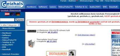
Geizhals.at
 Geizhals is a site where you can compare product prices for electronic devices and computer equipment on the Austrian market (and also up to some degree the European market).
Navigation
 There are two navigation possibilities given: one on the left side and one on the top of the page. They contain the same topics on the main page. But as soon as you select one topic the left navigation menu changes and there is no way of selecting the other categories any more.
Users could be confused because of this navigation change. Although there are two navigation menus given, the user is forced to use the top menu to have control over the categories.
This problem is common to web pages with more than one navigation menu and no clear semantic distinction between the menus. Geizhals.at has a non consistent navigation system and both menus are not differentiable.
Based on Grice's Maxims this would violated the Manner Maxim since there are two menus that look like the same but indeed have different purposes. This ambiguity should be avoided.
Chello.at
![]() Chello is an Austrian internet provider offering DSL and cable-based products.
Chello is an Austrian internet provider offering DSL and cable-based products.
Check for Product Availability
 On every page on the site there is an advertisment placed offering a check if Chello products are available in the user's region. If you click on it you have to enter your postal address. After that you have to press the check button to proceed.
 In the next step a dialog comes up showing all available products but there is no detailed information about them. The radio button suggests that you have to choose one product and get some information about it when clicking on the next button. Unfortunatly the semantic of the next button is different: it brings you to a mask where you can enter personal data in order to purchase the product (!). The product details are only available when clicking on the questionmark after the product name.
Based on Grice's Maxims this would violated the Quantity Maxim since there is no information provided on the products shown as being available. Furthermore the Manner Maxim is violated because the next button leads you to a purchase dialog what is obscure.
Astra.de
 Astra is the
homepage of analog and digital satellite provider Astra. On this platfrom
they provide information about their scope of services as well as setup
instructions and channel lists.
Astra is the
homepage of analog and digital satellite provider Astra. On this platfrom
they provide information about their scope of services as well as setup
instructions and channel lists.
Mainpage/Navigation
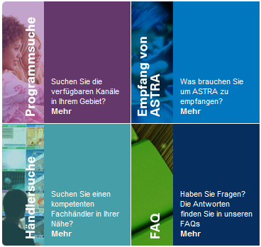 As the main part of their startpage Astra shows a selection of
some of their sections as shown in the picture. It's fine to emphasize their
most important sections by giving them so much space but trying to perform a
navigation could confuse people. The four different pictures pretty much
look like buttons and people will try to click on them to navigate to the
given section but the only link available is hidden under the text "Mehr"
("More"). It doesn't really stand out against the other text and therefore
some people could actually search for it for just some time.
As the main part of their startpage Astra shows a selection of
some of their sections as shown in the picture. It's fine to emphasize their
most important sections by giving them so much space but trying to perform a
navigation could confuse people. The four different pictures pretty much
look like buttons and people will try to click on them to navigate to the
given section but the only link available is hidden under the text "Mehr"
("More"). It doesn't really stand out against the other text and therefore
some people could actually search for it for just some time.
The failure of not distinguishing the important information from the inferior and thereby marking links so that they can't easily be found offends against the law of Wilson & Sperber. Since these links are there for easy navigation to the most important sections according to Wilson & Sperber the required effort to understand how to actually navigate must be relatively low but it isn't. Aside of this the shown form of naviagation also breaks with Grice's Manner maxim since it shows some form of buttons and therby suggests that these are clickable but they are not which leads to a obscurity of expression.
The problem could easily be fixed by making the whole button clickable which would fulfill the anticipation that it is. If this is not possible at least the actual link "Mehr" ("More") could somehow be emphasized a little more for example by adding some color. Most likely it would already be better if three dots ("...") where added to the word "Mehr" ("More") indicating more clearly that more information can be found by following this link.
Channel Search
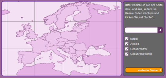 On their homepage Astra offers the possibility to search for
channels. The above image shows the simple search screen. There are some
options (Digital, Analog, PayTV, FreeTV) to select or deselect to refine
ones search. There is also sort of a dropdownbox shown here but we are happy
with our selection and want to perform a search without further refinement
so we press the button for performing our search. Nothing happens - there is
no feedback that something went wrong and no search results are shown. What
happend? The dropdownbox is actually there for selecting a country which can
be done by clicking on it in the map, which is nice, or selecting it in the
dropdown. The problem is, that there is no information available, that a
country must be selected to perform a search and there is no feedback that
the country is missing when the button is pressed.
On their homepage Astra offers the possibility to search for
channels. The above image shows the simple search screen. There are some
options (Digital, Analog, PayTV, FreeTV) to select or deselect to refine
ones search. There is also sort of a dropdownbox shown here but we are happy
with our selection and want to perform a search without further refinement
so we press the button for performing our search. Nothing happens - there is
no feedback that something went wrong and no search results are shown. What
happend? The dropdownbox is actually there for selecting a country which can
be done by clicking on it in the map, which is nice, or selecting it in the
dropdown. The problem is, that there is no information available, that a
country must be selected to perform a search and there is no feedback that
the country is missing when the button is pressed.
The failure of not providing enough information for people to understand that something should be selected violates Grice's Quantity Maxim which states that contributions should be as informative as necessary. This is clearly not fulfilled in this simple search facility on Astra.de since there is no feedback on what went wrong when the user clicks on the search button without selecting a country. Furthermore the given example once again violates Grice's Manner Maxim since the information given in the text is in a form where one could think that the selection of a country is as optional as are the options below of it.
The solution to the problem described above is quite simple: Provide the user with feedback which gives him the ability to understand what he has to do. Furthermore the dropdownfield for the country could be described by a lable and there could even be a * added to this text which in todays world allready has the meaning of a required field.
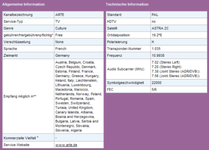 We found another part of the page where it breaks the
laws of Grice: This screenshot displays the detailed information on a channel
found by the channel search described above. As can be seen German and
English text both appear side by side totally mixed which violates Grice's
theorem to be orderly. Besides of that the selected TV channel ARTE is stated
to be transmitted in French language only which just simply isn't true and really
diminishes the quality of this page.
We found another part of the page where it breaks the
laws of Grice: This screenshot displays the detailed information on a channel
found by the channel search described above. As can be seen German and
English text both appear side by side totally mixed which violates Grice's
theorem to be orderly. Besides of that the selected TV channel ARTE is stated
to be transmitted in French language only which just simply isn't true and really
diminishes the quality of this page.
news.ORF.at
 ORF.at is the
homepage of the Austrian national broadcasting services and provides general
national and international news as well as information regarding the
services themselves.
ORF.at is the
homepage of the Austrian national broadcasting services and provides general
national and international news as well as information regarding the
services themselves.
Inconsistant Navigation
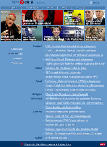 At
the frontpage of ORF.at an overview of the latest news from different
categories is given. The information is displayed in a frameset leaving the
headline news and the bar at the bottom always visible to the user, while
scrolling the information in the middle. The link in the bar at the bottom
is especially interesting since it leads to an overview of all different
topic areas. Therefore it is fairly important and used quite often. The
problem is, that the described way of displaying a page is only true for the
mainpage. All other subpages on ORF.at are not displayed as framesets. So
the important link to the overview over all topics can only be found after
scrolling down in the page all the way. Since there is no patency through
out the page it is difficult for people to even realize that the described
link is available on all pages and even more difficult to actually find
it.
At
the frontpage of ORF.at an overview of the latest news from different
categories is given. The information is displayed in a frameset leaving the
headline news and the bar at the bottom always visible to the user, while
scrolling the information in the middle. The link in the bar at the bottom
is especially interesting since it leads to an overview of all different
topic areas. Therefore it is fairly important and used quite often. The
problem is, that the described way of displaying a page is only true for the
mainpage. All other subpages on ORF.at are not displayed as framesets. So
the important link to the overview over all topics can only be found after
scrolling down in the page all the way. Since there is no patency through
out the page it is difficult for people to even realize that the described
link is available on all pages and even more difficult to actually find
it.
The absence of patency infriges Grice's Manner Maxim in being obscure and not orderly. The solution to fix the stated inconsitency could be to just add conistency to the page by either adapting all subpages or the frontpage so that in the end a straight look and feel can be achieved.
Zeus System (Studentportal at the University of Klagenfurt)
 The University of Klagenfurt offers an online
system for students and teachers which provides management of all courses and exams called Zeus. For students the system allows to signup, show detailed information, look up grades and to perform administrativ work regarding their portfolio of courses and exams.
The University of Klagenfurt offers an online
system for students and teachers which provides management of all courses and exams called Zeus. For students the system allows to signup, show detailed information, look up grades and to perform administrativ work regarding their portfolio of courses and exams.
Navigation in exam details
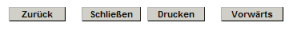 Like mentioned before the Zeus system allows students to look at the details of a given exam and to investigate the grades received. To fullfil this task a list of all attended exams is displayed and the selection of a particular one leads to a details page. This page is displayed in a new pop-up browser window and offers the navigation options shown in the image. The buttons from left to right have the following meanings: back, close, print, forward. One could now think that a click on the back or forward button lets you cycle through the list of all exams. But in reality it looks like this: Neither a click on back nor on forward leads to any noticeable state change.
The implementation of the Zeus system clearly violates Grice's Manner Maxim here by providing obscure information. It also violates the Quality Maxim by indicating that going back- and forwards is possible but actually nothing happens when one is trying to.
The solution to this problem seems quite easy to us: Do not display any buttons that have no underlying function.
